About MGM Resorts
MGM is one of the world’s leading global hospitality and entertainment companies, with over 30+ resort properties. They cater to 70 million guests annually on average, spanning across the U.S. and international locations, offering not only world-class accommodations but also a wide range of entertainment, dining, and gaming experiences.
32 resorts
in the U.S. and international
in the U.S. and international
70+ million
guests a year
guests a year
About Vega Design System
Vega is a multi-brand/platform Design System. it is extensively documented in Zeroheight and serves all our platforms, iOS, Android, web (mobile & desktop), our marketing emails and kiosks.
It is built with Design Tokens and on its core uses Atomic Design.
It is built with Design Tokens and on its core uses Atomic Design.
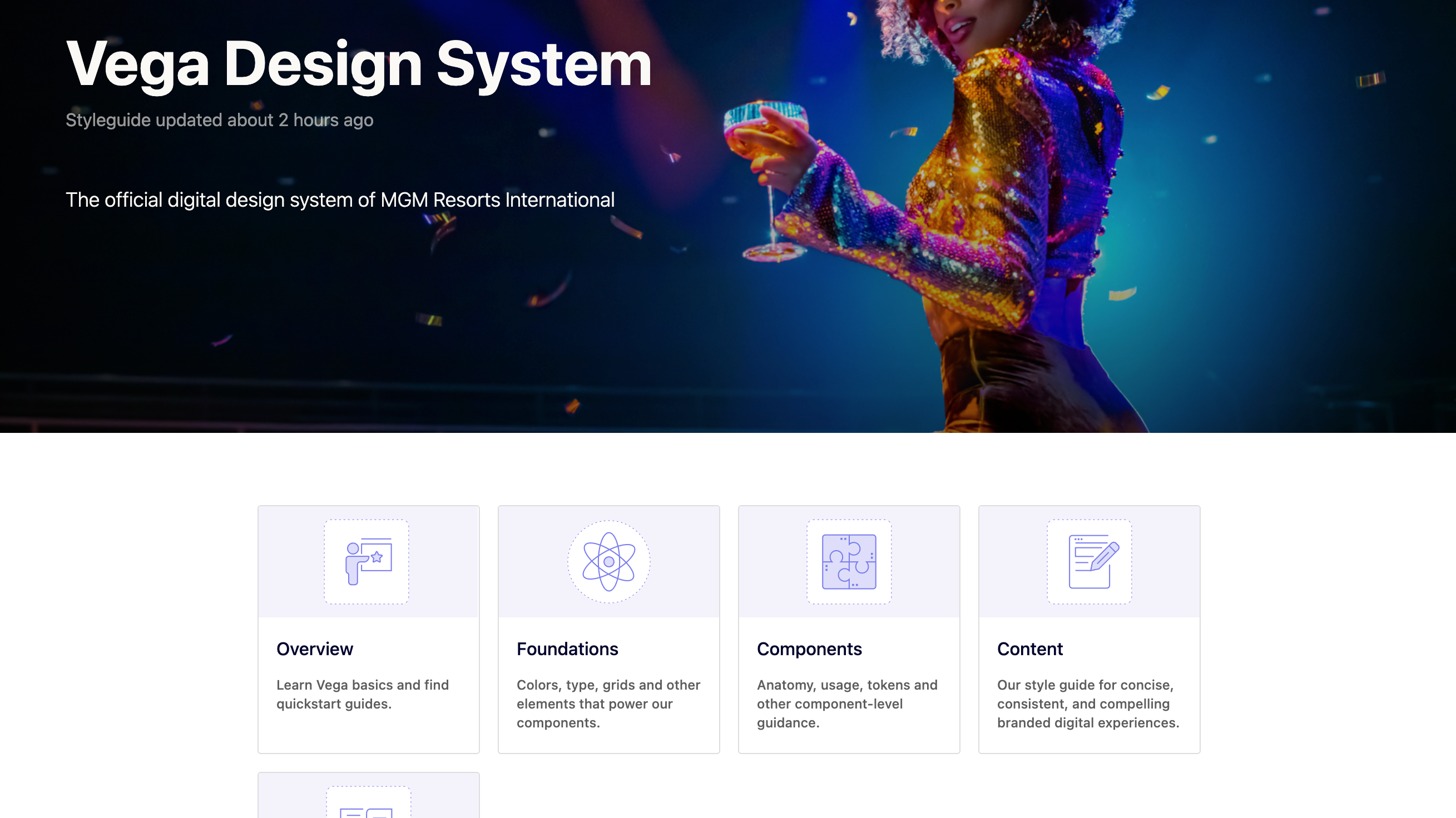
A sneak peek of our documentation built with Zeroheight
My role
As a lead designer on the team I:
⭐️ Managed our backlog in Jira, facilitated daily standups and conducted sprint retrospectives.
⭐️ Hosted office hours, managed Slack channels, and wrote release notes to communicate changes to stakeholders
⭐️ Led the vision and strategy for the design system, created detailed roadmaps and made sure to align to our business priorities
⭐️ Partnered with product managers to prioritize features and tasks, ensuring alignment between design and product
⭐️ Led presentations and strategic conversations with stakeholders
⭐️ Oversaw, approved, and created final deliverables, including Figma designs, documentation, token branches, presentations, and more
⭐️ Developed and documented team processes
An overview of a roadmap I created to communicate with stakeholders about how we align design system with business priorities
The challenge
When I joined MGM to create Vega, our first priority was conducting a comprehensive audit. We discovered that different teams had applied inconsistent interpretations of color, spacing, typography, and components across web and mobile platforms.
The existing UI was driven by 2 different legacy design systems, resulting in a lack of visual coherence and a disjointed user experience.
The existing UI was driven by 2 different legacy design systems, resulting in a lack of visual coherence and a disjointed user experience.
How might we ensure consistent use of color, spacing, and typography across all digital products?
Pain points & needs
Our guests
Inconsistency across platforms
Guests may experience confusion and frustration when components display different information across mobile, desktop, and app platforms. Guests need a consistent experience across all devices so that they can trust the information and layout, no matter where they are shopping.
Guests may experience confusion and frustration when components display different information across mobile, desktop, and app platforms. Guests need a consistent experience across all devices so that they can trust the information and layout, no matter where they are shopping.
Accessibility Issues
Small font sizes and poor color contrast, make components hard to read and interact with for customers with visual impairments, violating accessibility standards and alienating certain user groups. Guests need an interface that is easy to read and interact with, no matter their device or visual abilities.
Small font sizes and poor color contrast, make components hard to read and interact with for customers with visual impairments, violating accessibility standards and alienating certain user groups. Guests need an interface that is easy to read and interact with, no matter their device or visual abilities.
The business
High maintenance costs
Every design update—whether a small color tweak or a layout adjustment—requires manual changes in multiple places, leading to duplicated efforts, increased development time, and higher operational costs. We need a centralized and scalable solution that allows for efficient updates across all platforms and products.
Every design update—whether a small color tweak or a layout adjustment—requires manual changes in multiple places, leading to duplicated efforts, increased development time, and higher operational costs. We need a centralized and scalable solution that allows for efficient updates across all platforms and products.
Poor scalability
Each new feature or update adds complexity, leading to design fragmentation, slower delivery, and higher chances of error, making it harder to scale efficiently. We need a scalable framework, that allows for seamless expansion while maintaining consistency. Enable quick updates across all touchpoints, ensuring efficiency and cohesion as the product grows.
Each new feature or update adds complexity, leading to design fragmentation, slower delivery, and higher chances of error, making it harder to scale efficiently. We need a scalable framework, that allows for seamless expansion while maintaining consistency. Enable quick updates across all touchpoints, ensuring efficiency and cohesion as the product grows.
Lack of theming capabilities
No theming capabilities, leading to a diluted identity and reduced recognition for our resort brands. We need a flexible theming system that allows for seamless customization across brands, ensuring each resort maintains a distinct and recognizable identity while preserving consistency within the overall brand ecosystem.
No theming capabilities, leading to a diluted identity and reduced recognition for our resort brands. We need a flexible theming system that allows for seamless customization across brands, ensuring each resort maintains a distinct and recognizable identity while preserving consistency within the overall brand ecosystem.
The team
Ambiguity
Designers face ambiguity when it comes to in choosing a color, text style or space value for their specific use case, leading to inconsistent decisions across projects. We need clear, standardized design guidelines that empowers designers to make informed choices.
Designers face ambiguity when it comes to in choosing a color, text style or space value for their specific use case, leading to inconsistent decisions across projects. We need clear, standardized design guidelines that empowers designers to make informed choices.
Endless QA
Designers and developers often spend excessive time in the design QA phase, constantly going back and forth to ensure that designs are accurately implemented. We need a streamlined QA process that minimize misunderstandings and improves alignment.
Designers and developers often spend excessive time in the design QA phase, constantly going back and forth to ensure that designs are accurately implemented. We need a streamlined QA process that minimize misunderstandings and improves alignment.
Collaboration bottlenecks
Designers may deliver specs that aren’t easily translatable into code, while engineers might interpret design elements differently, leading to inconsistencies and errors in implementation. We need a streamlined process to bridge the gap between design and development, and provide a single source of truth.
Designers may deliver specs that aren’t easily translatable into code, while engineers might interpret design elements differently, leading to inconsistencies and errors in implementation. We need a streamlined process to bridge the gap between design and development, and provide a single source of truth.
Guests, business and team pain points and needs, clearly directed us to a single solution: design tokens.
Discovery
Planning
During the planning phase, we held weekly meetings with engineers, leadership, product, and accessibility teams. These sessions led to a series of key agreements that guided our execution.
We addressed critical questions such as:
What’s the best way to push design tokens to GitHub?
How should we document design tokens and make them accessible to everyone?
What will the process look like after launching the first set of design tokens?
In addition, we created a roadmap and timeline estimation that we carefully reviewed with our leadership.
Color explorations
We decided to focus our experiments on color first, recognizing it as the most critical component of our theming strategy.
We focused on defining our dark color palette by selecting shades that closely matched the contrast ratios of their light counterparts, with the intention of ensuring accessibility from the start.
But even though mathematically speaking it made sense, visually it didn’t seem right, so we ended up manually adjusting the colors to account for perception.
A unique approach to theming
In early discussions with leadership and stakeholders, we found out that dark mode was not one of the company’s priorities. Instead, we proposed a pseudo-theme, a secondary color palette to introduce dynamism to the experience that we would apply intentionally in key moments.
For example, a guest could browse restaurant options in their room using our default brand theme, but in a dimly lit elevator, the digital key experience would be designed with this pseudo-theme, ensuring the screen doesn’t shine too brightly and disrupt their environment.
This approach offered three key advantages:
Velocity
It allowed us to quickly create a theme without migrating all components at once, but incrementally.
It allowed us to quickly create a theme without migrating all components at once, but incrementally.
Seamless transition
Gave us the opportunity to test and resolve issues before launching a full theme and soften the learning curve, enabling a smooth transition with minimal disruption.
Gave us the opportunity to test and resolve issues before launching a full theme and soften the learning curve, enabling a smooth transition with minimal disruption.
Flexibility
Enabled developers and designers to seamlessly use both default and dark palettes within the same screen or journey, without the cognitive burden of determining which colors to apply.
Enabled developers and designers to seamlessly use both default and dark palettes within the same screen or journey, without the cognitive burden of determining which colors to apply.
Agreements at the end of discovery
⭐️ Our tool of choice to push tokens to Github will be Tokens Studio for Figma.
⭐️ Agreed on a pseudo-theme as our initial approach
⭐️ We will follow the common token tier model: core, semantic and component
⭐️ Tokens will be documented in Zeroheight
⭐️ Defined and documented main processes: pipeline, new token, update and deprecation
⭐️ Agreed on a pseudo-theme as our initial approach
⭐️ We will follow the common token tier model: core, semantic and component
⭐️ Tokens will be documented in Zeroheight
⭐️ Defined and documented main processes: pipeline, new token, update and deprecation
Execution
Defining the taxonomy
The goal of building the taxonomy was to establish a scalable and predictable naming convention that was intuitive and logical for all users. To achieve this, we decided to implement based on the common three-tier model.
The goal of building the taxonomy was to establish a scalable and predictable naming convention that was intuitive and logical for all users. To achieve this, we decided to implement based on the common three-tier model.
Core tokens
Core tokens have, intentionally, no inherent design intent for how or where they should be used. They lack semantic precision and hold little value in creating a cohesive visual language, however they were essential when keeping the system scalable and flexible.
Semantic tokens
This is were the magic happens! Semantic tokens are the bridge between value and purpose. This tier makes theming possible, we visualize it as giving each token a job title, so designers and developers always know exactly what it's supposed to do.
We grouped our color semantic tokens into 3 simple groups:
Foreground
To be applied to elements that sit at the front layer: text, iconography and dividers or borders.
Background
Self explanatory, colors than can be applied to any surface.
Interaction
To be applied to any interactive element, could be a button background or a text link color.
The rest of the tokens like size, space, etc. remained under their own category with no other nested group for simplicity.
Component tokens
Component tokens define the specific properties of a component and they are highly descriptive. This layer provides complete autonomy for each component, allowing for modular and flexible updates without affecting other components.
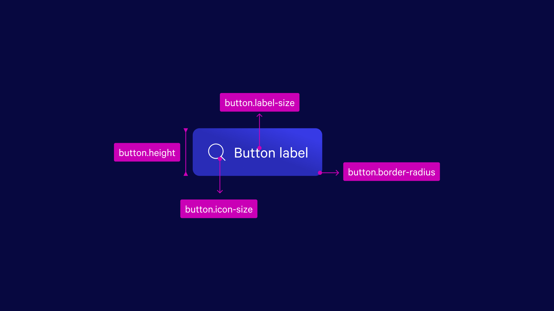
To name and classify component tokens we created a framework, ordered from the most generic categories to more specific, resulting in tokens that have natural, human-friendly names.
Handoff and documentation
For handoff, we used Tokens Studio to push directly to GitHub, and documented token usage and guidelines in Zeroheight.
For handoff, we used Tokens Studio to push directly to GitHub, and documented token usage and guidelines in Zeroheight.
A system is only as good as its adoption
Spreading the word
We participated in multiple presnentations, including a couple of Brown Bag Sessions and All Hands to socialize our design tokens strategy across teams, our goal was to create awareness and get the teams excited to use design tokens once fully released. These sessions helped everyone understand the value of tokens and how to implement them effectively.
We participated in multiple presnentations, including a couple of Brown Bag Sessions and All Hands to socialize our design tokens strategy across teams, our goal was to create awareness and get the teams excited to use design tokens once fully released. These sessions helped everyone understand the value of tokens and how to implement them effectively.
Integrating theming into Figma
We build component variants with the new dark theme color and embed theming into the properties panel of each component. This was before Figma variables were a thing.
We build component variants with the new dark theme color and embed theming into the properties panel of each component. This was before Figma variables were a thing.
A new handoff process
We intentionally kept core and component tokens hidden from our system users. This decision simplified the adoption process, as users only had to work with higher-level, more accessible tokens that aligned with their immediate needs.
We also, decided to not create tokens as Figma styles, instead we created a plug-in that allowed designers to select a pixel value or hex code from their handoff documentation, run the plugin, and instantly swap it for the corresponding token value.
Impact
Vega XL
A couple of years after we launched the first version of our design tokens, the in-property kiosks were ready to migrate to Vega Design System. Once the project kicked off, we quickly realized that our components were too small for an optimal touchscreen experience.
I was able to map all our size and spacing tokens to new values, and built a fresh new theme in just 3 days. After a couple days of testing and fine-tuning, we handed it off. Developers were able to implement the new theme in just 6 days, reducing the implementation time by 90%.
The Cosmopolitan of Las Vegas
In early 2023, MGM acquired The Cosmopolitan of Las Vegas, a hotel known for its bold and visually striking brand identity. When migrating TCOLV identity into the Vega, we quickly realized that their original brand identity was becoming diluted.
To address this, one product designer and I worked together to create a new color theme that preserved TCOLV's visual identity while aligning it with Vega standards. In just a couple days, we developed a comprehensive color scheme, ensuring their branding remained recognizable and cohesive.
Unfortunately, I left the company shortly after, so I wasn't able to gather information on the implementation time or its impact at a larger scale.
Reflecting on the outcomes
Love-hate component tokens
Working with component tokens was hands down the most challenging part of this project. We made tons of mistakes, second-guessed ourselves, and seriously underestimated how much work it would take, it came with the biggest learnings.
Working with component tokens was hands down the most challenging part of this project. We made tons of mistakes, second-guessed ourselves, and seriously underestimated how much work it would take, it came with the biggest learnings.
Always overcommunicate
I learnt to be very vocal about the work I was doing to ensure everyone was aware and onboard on every step. Communication was key specially when dealing with unexpected delays.
I learnt to be very vocal about the work I was doing to ensure everyone was aware and onboard on every step. Communication was key specially when dealing with unexpected delays.
Big wins take time
While we celebrated some early successes after finalizing this initiative, the real transformation took months to materialize. It wasn’t just about shipping but also stabilizing the workflow, getting everyone on board, and ensuring consistent adoption across teams. The true impact became evident only much later, as the system fully integrated into daily processes.
While we celebrated some early successes after finalizing this initiative, the real transformation took months to materialize. It wasn’t just about shipping but also stabilizing the workflow, getting everyone on board, and ensuring consistent adoption across teams. The true impact became evident only much later, as the system fully integrated into daily processes.


