Why Vega?
Vega is the brightest star in the constellation Lyra and one of the most luminous stars in the night sky.
It is a vibrant symbol of perpetual motion and magnetism, burning brighter and spinning faster than our sun.
Its home constellation Lyra represents the lyre, an ancient instrument and early form of entertainment.
These characteristics—the bright guiding glow, the allure, the gravitational pull, the symbolism of entertainment’s importance to the human experience—represent our brand ideals now and into the future.
Problem statement
How can MGM Resorts International efficiently design, engineer, and maintain over 4,000 web pages and app screens across a variety of digital touchpoints, including customer-facing websites, mobile apps, employee portals, on-premise kiosks, and email communications?
This challenge spans 20 nationwide resort brands under the MGMRI umbrella, including MGM Resorts, MGM Rewards, Las Vegas, and regional resorts, all powered by dozens of back-end technology systems and managed by a multitude of independent product teams and systems administrators. The complexity of coordinating across these diverse systems and stakeholders calls for a scalable and sustainable solution to ensure brand consistency, performance, and seamless user experiences.
Governance model
"Centralized decision making and automate out" was our motto. We believe that a central team, can collaboratively set and maintain design standards across all digital touchpoints without stifling creativity. This core group focuses on creating a shared understanding of design principles and ensuring coherence while offering a flexible foundation for teams to innovate within. By centralizing decisions, we establish a consistent set of design patterns, tokens, and components that guide different product teams, helping them maintain brand integrity and efficiency while still allowing space for creative solutions tailored to each platform's unique needs.
Automation plays a key role in this approach, scaling the design system across thousands of pages and screens. Automating repetitive tasks like applying design tokens or implementing system-wide updates reduces manual effort and minimizes errors, freeing teams to focus on more creative and strategic work. Automated tools also ensure that standards are consistently met without manual oversight, maintaining quality across outputs. Moreover, automation allows for rapid system-wide updates, enabling changes to design tokens or components to propagate seamlessly across all pages and screens. This balance of centralized decision-making and automation creates a system that preserves consistency while empowering teams with the creative freedom to adapt and innovate.
My role
As the lead designer of the design system team, my role was both strategic and hands-on. I was responsible for shaping the initial strategy, setting the foundation for the design system's structure and vision. My work involved creating the design tokens architecture, ensuring that every element was built for scalability and consistency across the vast array of products and platforms. I took on the challenge of hands-on design work, directly contributing to the creation of core components, patterns, and documentation that formed the backbone of our system.
In addition to my hands-on responsibilities, I led reviews, where I provided feedback to designers and developers to ensure alignment with our design principles and brand standards. I also organized and led office hours, offering support and guidance to team members, answering their questions, and troubleshooting any issues that arose. Whether it was a technical challenge or a design decision, I was available to help teams across the organization make informed, effective choices that contributed to the success of our design system. My role was to foster collaboration, provide clarity, and ensure that the system empowered creativity while maintaining consistency across all outputs.
The process
To kick off the development of our design system, we began with a thorough initial audit, reviewing existing products and evaluating their consistency across platforms. This audit gave us a clear picture of the design challenges we needed to address and provided insight into opportunities for improvement. We also leveraged analytics from our previous design system to guide our decisions, identifying usage patterns, problem areas, and which components were most critical to prioritize. This data-driven approach helped us focus on building an initial set of components that would deliver the most immediate value to the teams using the system.
With this foundation, we created a detailed roadmap and architecture strategy. The roadmap outlined key milestones for component development, token architecture, documentation, and future scalability. Our architecture strategy was designed to ensure flexibility and consistency across multiple platforms, from websites to mobile apps, employee portals, kiosks, and beyond. Throughout this process, we maintained open and constant communication with key stakeholders—ranging from product teams to engineering leads and brand managers—to align expectations and ensure that everyone was on board with our vision. This collaborative effort was essential in ensuring the design system would meet the diverse needs of the entire organization.
Our initial roadmap that shows components aligned with business priortities
Following the initial scoping and planning, we moved into the design stage, setting a tight six-week timeline for the creation of our initial set of components. To keep the process efficient and focused, we identified three key milestones: Design, Refine, and Handoff. For each milestone, we established a clear checklist of deliverables, ensuring that every step was well-defined and aligned with our goals.
At the end of each milestone, we held reviews with key stakeholders, which included product teams, engineers, and brand managers. These reviews ensured that no one was left out of the process and allowed us to gather early feedback. This continuous communication made everyone feel involved in the creation of the design system, fostering a sense of shared ownership. The collaborative approach not only helped refine the system early on but also contributed to smoother adoption later, as stakeholders were already invested in its success from the outset.
In our design system architecture, we opted for a centralized model with a core library maintained exclusively by our team. This core library served as the foundation for our design system, ensuring consistency and coherence across all platforms. However, recognizing the importance of collaboration and creativity, we also established a shared library. This shared space allowed the entire design team to contribute and publish components they believed would be beneficial for everyone. By encouraging this collaborative approach, we harnessed diverse insights and innovations that enriched our design system.
Periodically, we evaluated components from the shared library to determine if they met the criteria for inclusion in our core library. This evaluation process ensured that only the most suitable and valuable components were integrated into the core library, maintaining its integrity and effectiveness.
Additionally, we supported the development of native libraries for our web and mobile app teams. While we provided oversight and guidance for these libraries, each team was responsible for their own maintenance and growth.
Vega libraries ecosystem
Design tokens
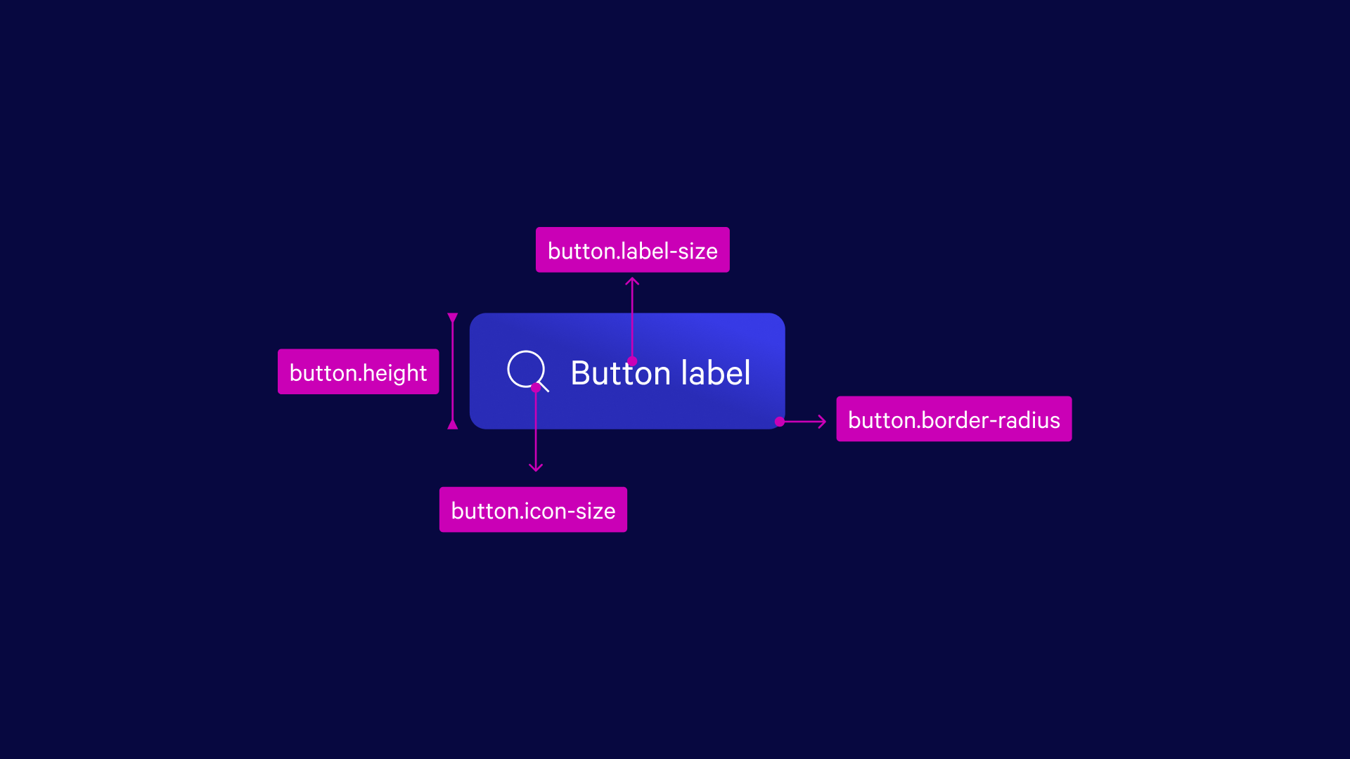
In the process of building Vega components, we integrated design tokens to ensure consistency and scalability across platforms. These tokens played a key role in maintaining the visual and functional integrity of the components. For a more detailed exploration of our design tokens architecture and implementation, you can check out the full case study here.
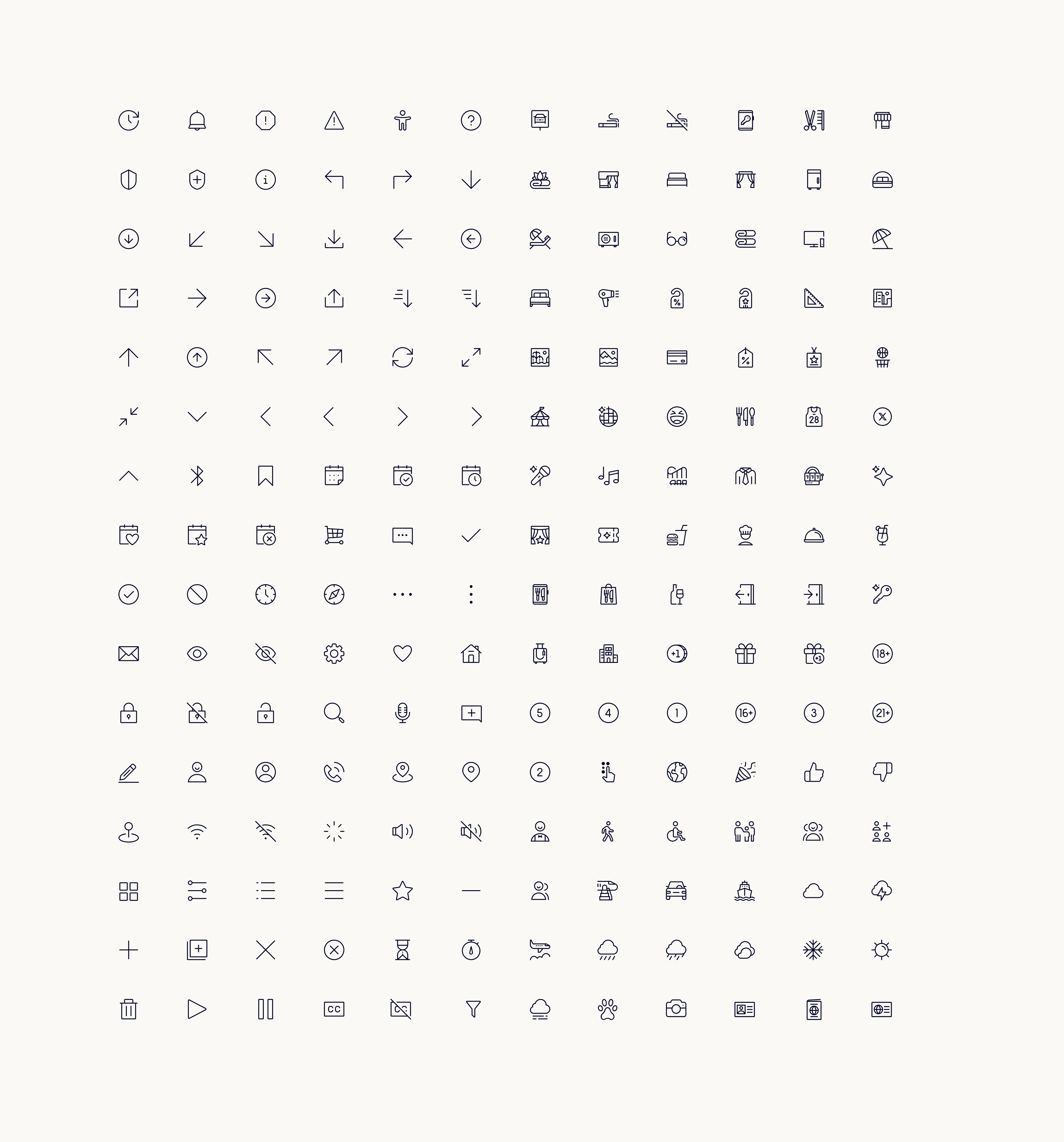
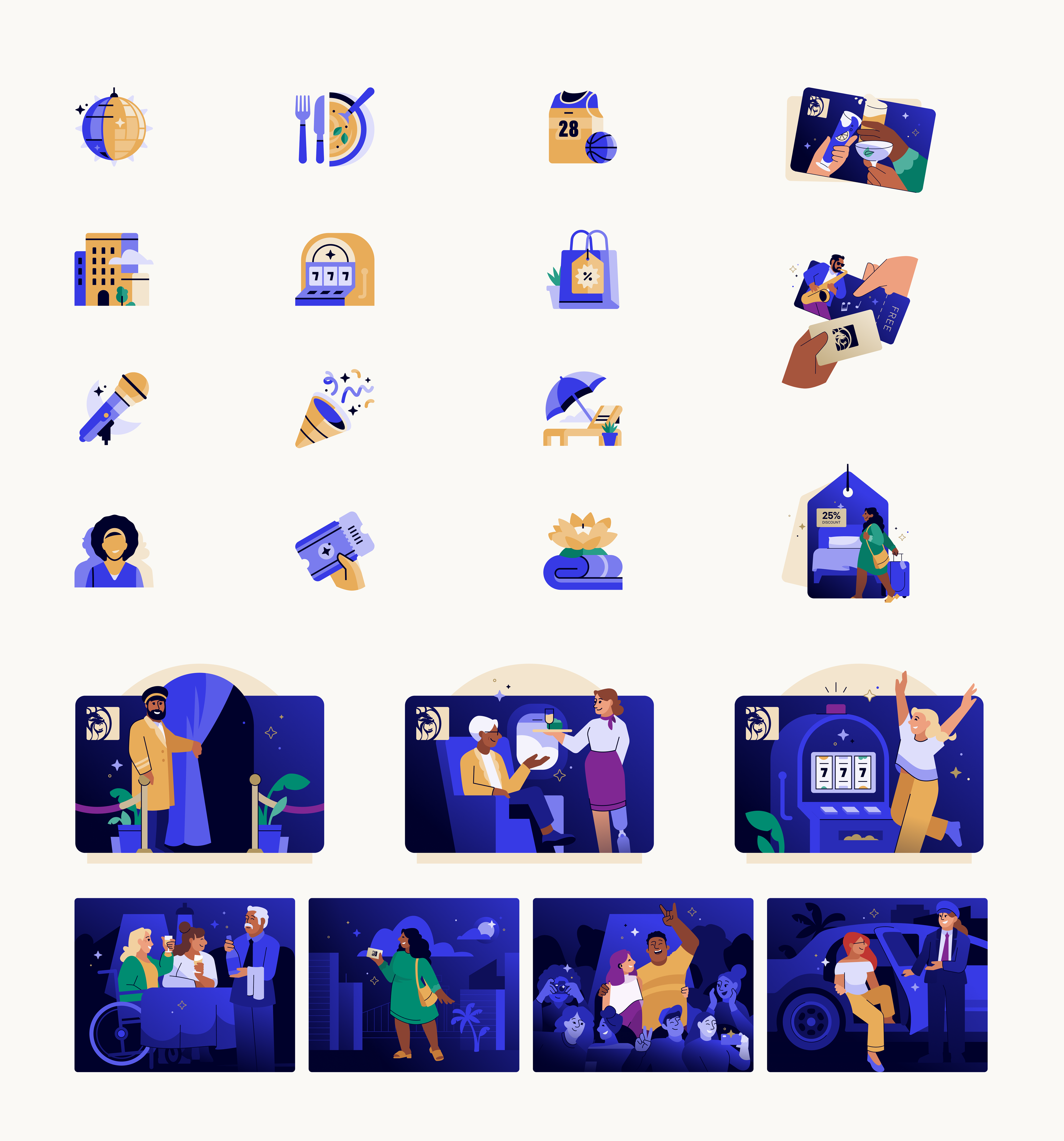
Icons and illustration
During the iconography and illustration process, while I wasn't directly involved in creating the icons or illustrations, I played a key role in integrating these essential elements into our design system architecture. I focused on defining the most efficient way to organize and publish them within the library, ensuring they were easily accessible and scalable across various platforms. Additionally, I provided feedback throughout the process, ensuring that the icons and illustrations were consistently aligned with our brand and visual guidelines.
I also helped define the processes for designers to request new icons and illustrations. This involved setting up clear guidelines and workflows to streamline the request process, ensuring that designers could easily submit their needs and that the new assets would align with our established brand and visual standards.
Brand color palette
The official brand palette for MGM Resorts Int'l & MGM Rewards is used for all brand communications across media. It consists of gold and blue tones that evoke nighttime in the Las Vegas desert—a warmer and more welcoming twist on the brand's historic black and gold theme.
Typography base kits
To simplify type applications and drive consistency, we created desktop and mobile base kits and guidelines for the most common page elements.
Each kit has five sizes with their respective usage for creating consistent typographical hierarchy.
While these are just a few examples of our foundational elements, our design system also included other key foundations such as a grid and layout system, shadows and elevation guidelines, a spacing system, and motion guidelines.
Components
When designing our components, we adhered to a comprehensive checklist to ensure that every element met the same high standards. This rigorous process helped us maintain both quality and consistency across the entire system, ensuring that all components were aligned with our design principles and worked seamlessly together.
Documentation
For documentation, we chose Zeroheight as our primary tool. It allowed us to consolidate all essential design system information in one place, including design specifications, usage guidelines, design principles, and brand standards. Zeroheight served as a comprehensive, accessible resource not only for designers but also for engineers, product managers, and leadership. By centralizing this information, we made it easier for all stakeholders to access relevant details and collaborate more effectively, ensuring that everyone was aligned with the design system's goals and best practices.
Implementation and quality assurance
During the implementation stage, the engineering team took the lead, and the process went smoothly, largely due to the constant communication we maintained from the early stages of design. This ongoing collaboration between design and engineering ensured that both teams were aligned and prepared, which minimized friction during the handoff.
We used Chromatic as our review tool, which allowed us to thoroughly examine each component design before it was added to the code library. This step was crucial in maintaining the quality and consistency of the system, as every component had to meet both design and technical standards before being fully integrated. The combination of clear communication and systematic reviews ensured a seamless implementation process.
Adoption and education
In the adoption stage, we put several processes in place to support and guide designers through their journey with the design system. We introduced weekly Office Hours every Friday, keeping them casual to foster an inviting and open environment. This allowed designers to feel comfortable asking questions, reviewing new patterns, or proposing new components. The casual nature of these sessions helped build trust and made sure that everyone felt supported.
We also implemented dedicated Slack channels where we regularly posted release notes and updates. These channels became a space for open discussion, where designers were encouraged to ask questions. The Slack threads proved invaluable as they created a trail of frequently asked questions, which could easily be referenced later when similar queries arose.
In addition to these efforts, we played an active role in key projects, acting as visual design consultants and design system advocates. By collaborating directly with designers, we built strong relationships across the team and ensured the system's principles were effectively implemented. These collaborative efforts were key to embedding the design system into the broader workflow and were recognized on a larger scale.
🎉 Our adoption process was honored as a finalist in the Best Adoption category in the first-ever Design System Awards by Zeroheight, marking a major milestone for the team. 🎉
If you'd like to know more about our adoption process, you can visit the Zeroheight Design System Awards page through this link: Zeroheight Awards. Additionally, I participated as a panelist in the Zeroheight webinar titled Best Adoption Practices. You can watch the full discussion here: Best Adoption Practices Webinar.
Business impact of Vega
The design system played a crucial role in several high-profile projects, directly contributing to their success.
Kiosks redesign
Design tokens were instrumental in adapting our components to larger screens, allowing us to significantly reduce development time by 80% during the redesign. This flexibility and scalability were key to meeting the project’s tight deadlines while maintaining consistency.
The Cosmopolitan of Las Vegas integration
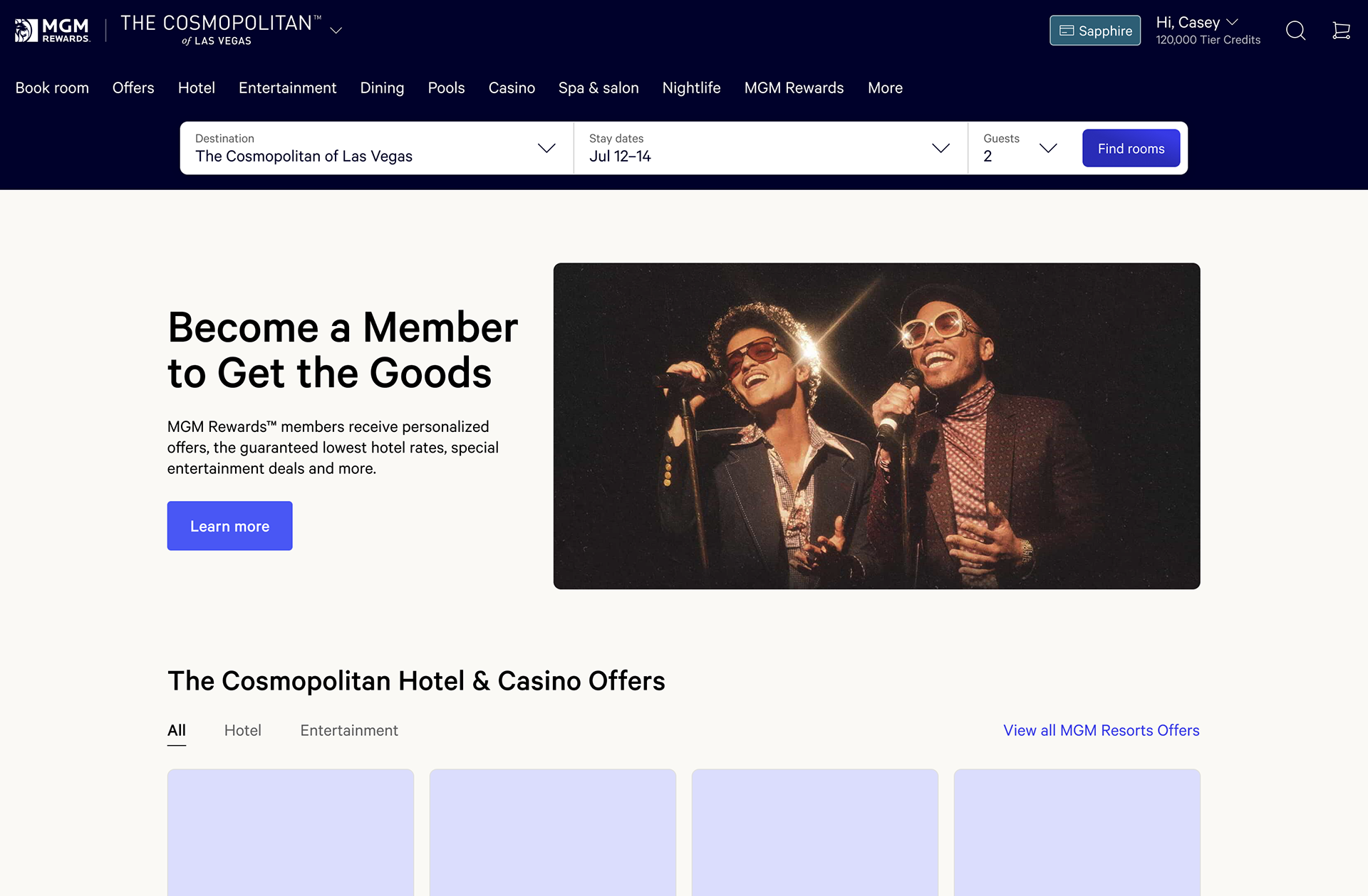
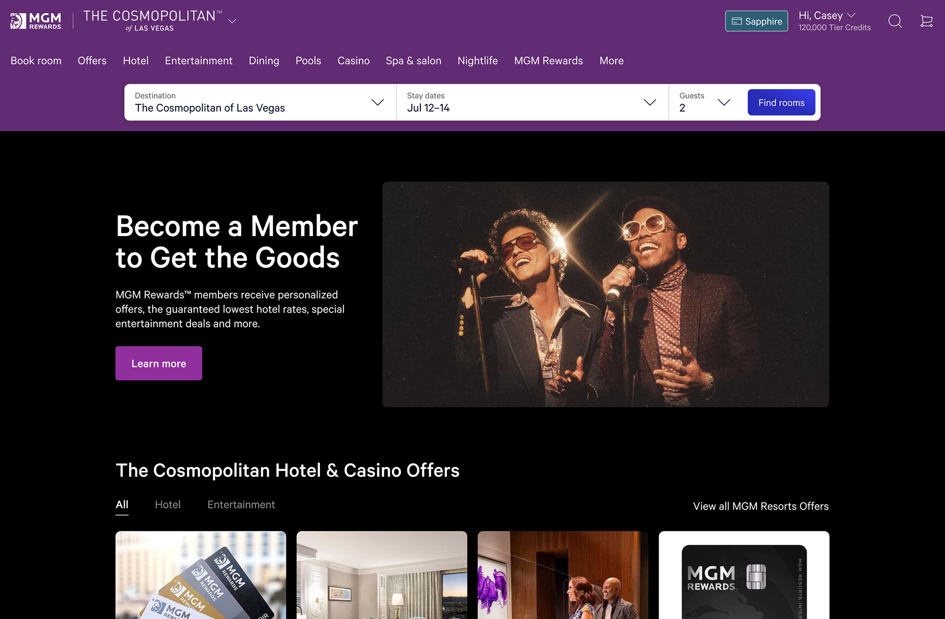
In the integration of The Cosmopolitan of Las Vegas (TCOLV) after its purchase, the design system enabled us to redesign their website by creating a new theme using design tokens. This approach also helped streamline the implementation process, reducing the overall time required for development.
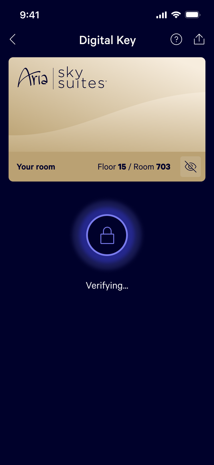
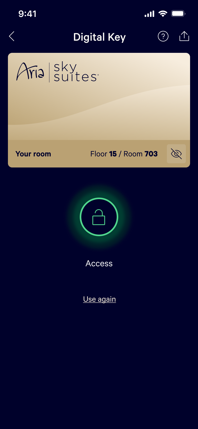
Digital key redesign
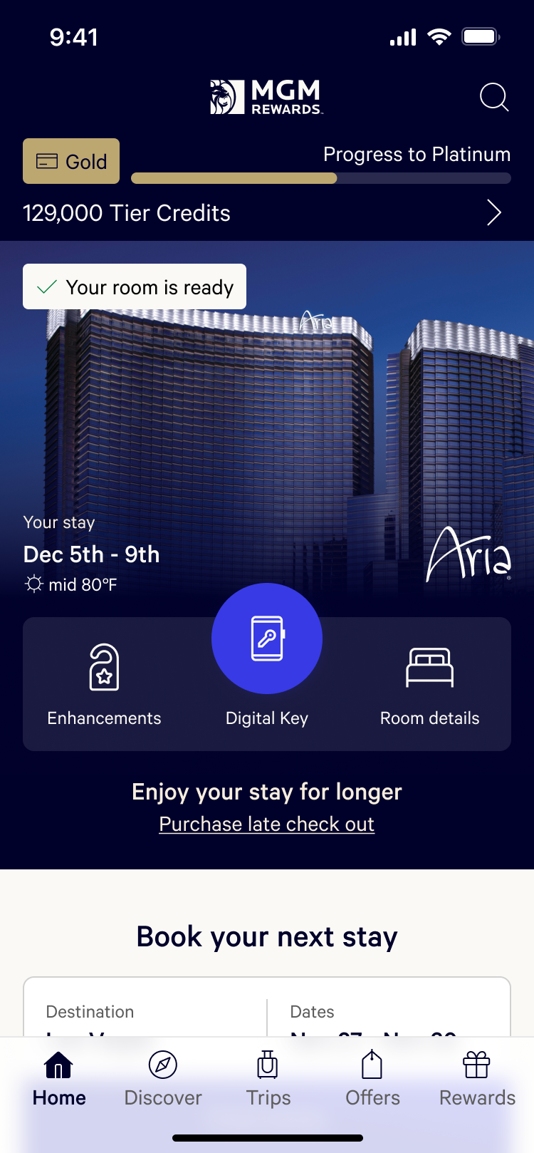
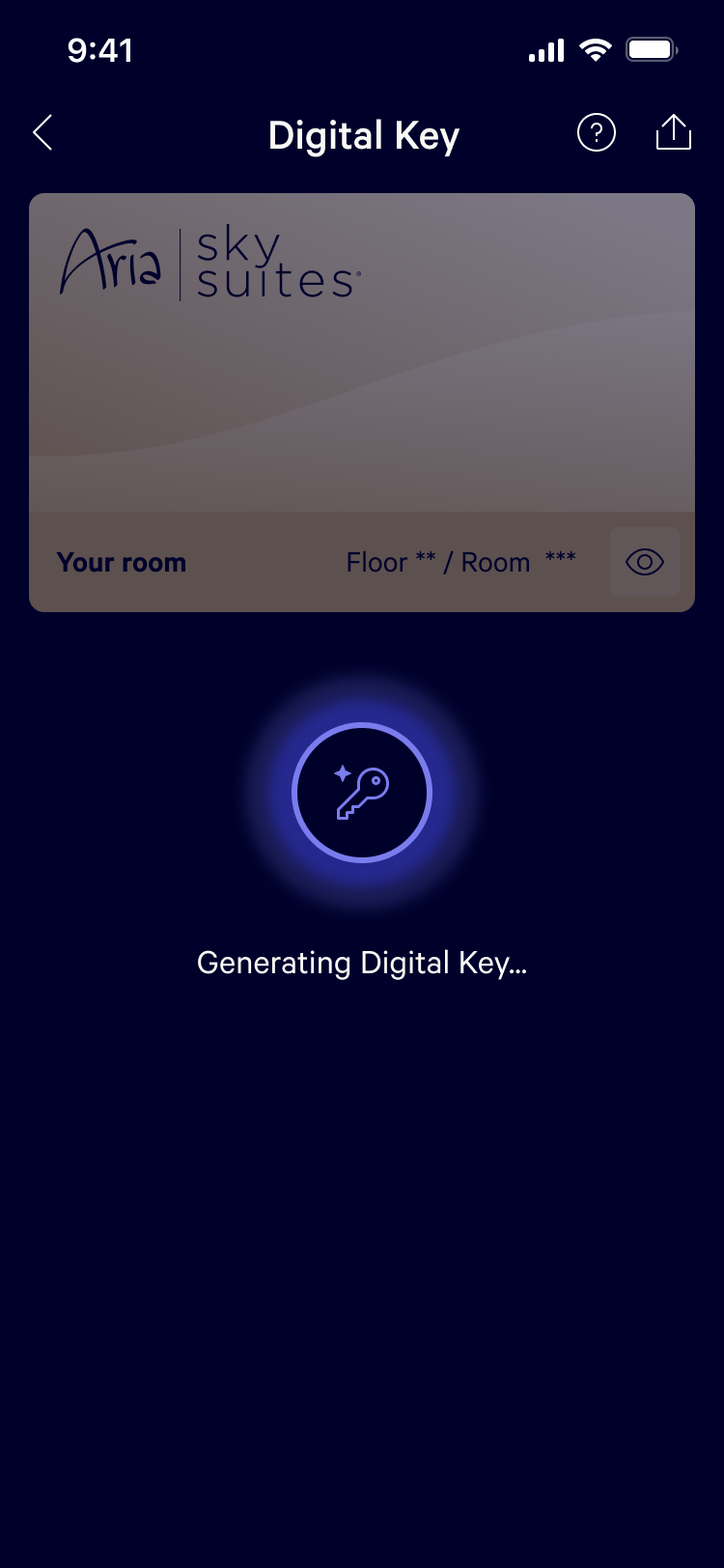
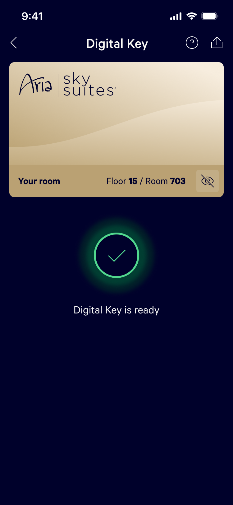
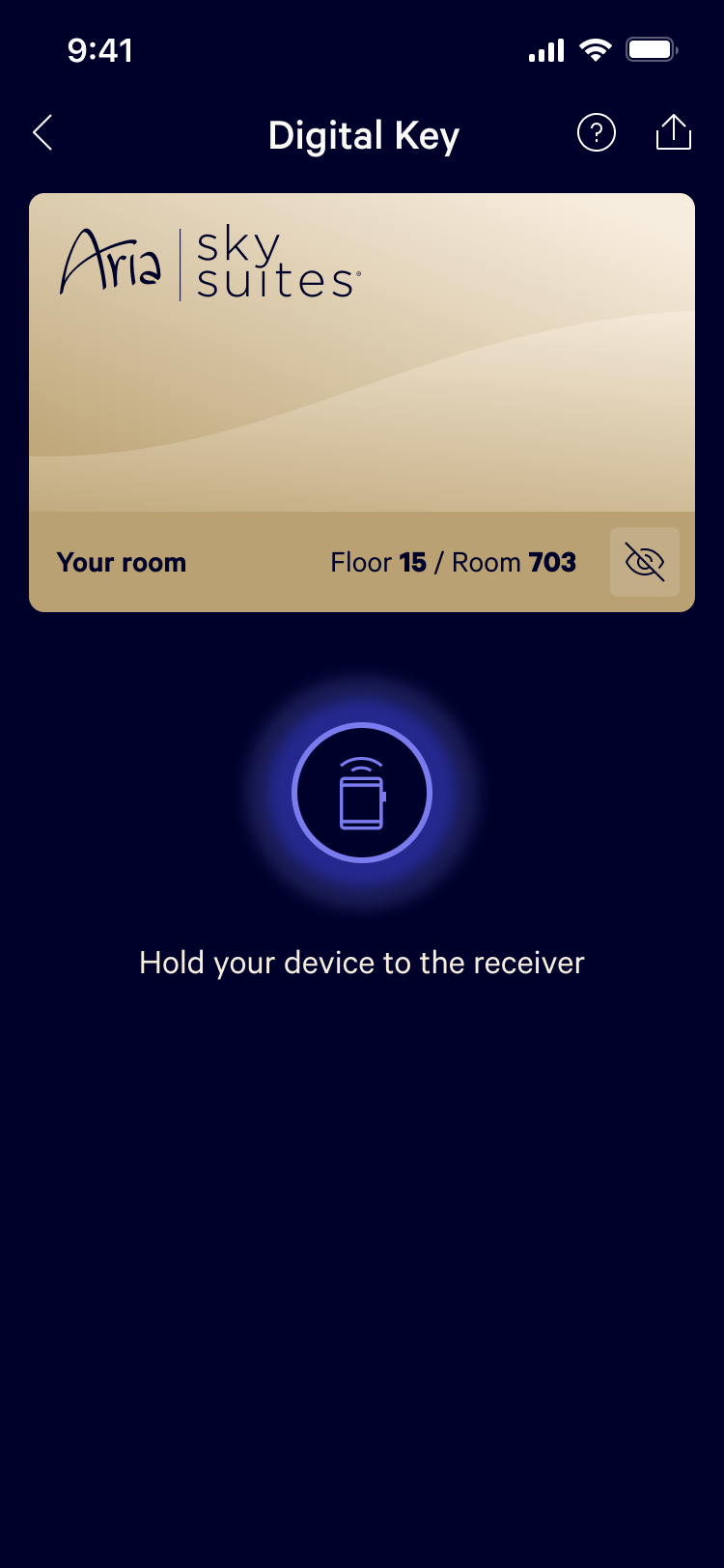
Another standout project was the redesign of the Digital Key experience. We worked closely with the design team to improve the user interface, and the success of this project earned us a place as a finalist in the Webby Awards for Best User Interface in 2024.
