About MGM Resorts
MGM is one of the world’s leading global hospitality and entertainment companies, with over 30+ resort properties. They cater to 70 million guests annually on average, spanning across the U.S. and international locations, offering not only world-class accommodations but also a wide range of entertainment, dining, and gaming experiences.
32 resorts
in the U.S. and international
in the U.S. and international
70+ million
guests a year
guests a year
About Vega Design System
Vega is a multi-brand/platform Design System. it is extensively documented in Zeroheight and serves all our platforms, iOS, Android, web (mobile & desktop), our marketing emails and kiosks.
It is built with Design Tokens and on its core uses Atomic Design.
It is built with Design Tokens and on its core uses Atomic Design.
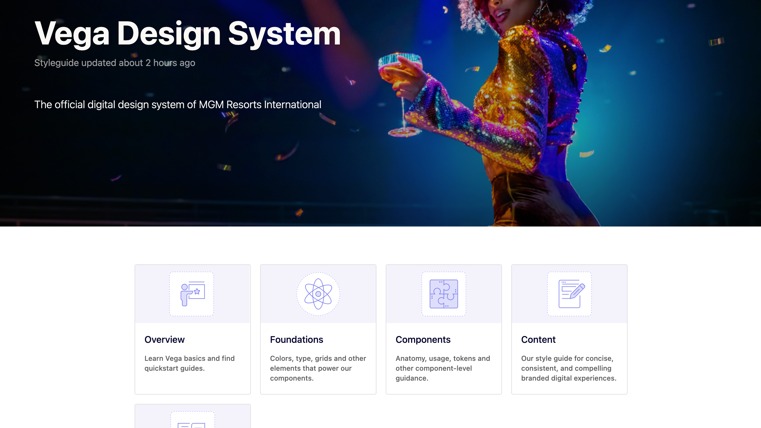
A sneak peek of our documentation built with Zeroheight
My role
As a lead designer on the team I:
⭐️ Led collaborative workshops and brainstorming sessions to drive creative solutions
⭐️ Made key design decisions and kept stakeholders informed on progress
⭐️ I ensured we adhered to timelines, communicated any blockers, and kept the team aligned
⭐️ I oversaw and approved the visual design, contributing to visual explorations and shaping the component architecture
⭐️ I also created, shipped and documented the component tokens
⭐️ I supported the engineering team with QA and reviews
⭐️ Conducted educational sessions to socialize the new components across the team
The challenge
We had many card types in use with multiple styles with no guidelines on how or when to use which card type. This inconsistency led to confusion for both guests and internal teams. Without a standardized approach, we saw a fragmented experience across platforms, making it difficult to maintain a cohesive brand presence. This presented an opportunity to unify and improve the design, ensuring consistency and scalability.
How might we provide clear guidelines and best practices for our teams, while delivering a thoughtful guest experience?
Pain points & needs
Our guests
Inconsistency across platforms
Guests may experience confusion and frustration when item cards display different information across mobile, desktop, and app platforms. Guests need a consistent experience across all devices so that they can trust the information and layout, no matter where they are shopping.
Guests may experience confusion and frustration when item cards display different information across mobile, desktop, and app platforms. Guests need a consistent experience across all devices so that they can trust the information and layout, no matter where they are shopping.
Lack of relevant information
If key details like pricing, category or availability are missing or not accessible on item cards, guests may struggle to make informed decisions, leading to frustration and potentially lower conversion rates. Guests need clear, comprehensive details like price, type of offering and availability upfront, so they can quickly make informed decisions without extra clicks.
If key details like pricing, category or availability are missing or not accessible on item cards, guests may struggle to make informed decisions, leading to frustration and potentially lower conversion rates. Guests need clear, comprehensive details like price, type of offering and availability upfront, so they can quickly make informed decisions without extra clicks.
Accessibility Issues
Small font sizes and poor color contrast, make components hard to read and interact with for customers with visual impairments, violating accessibility standards and alienating certain user groups. Guests need cards to be easy to read and interact with, no matter their device or visual abilities, so that they can shop comfortably and independently.
Small font sizes and poor color contrast, make components hard to read and interact with for customers with visual impairments, violating accessibility standards and alienating certain user groups. Guests need cards to be easy to read and interact with, no matter their device or visual abilities, so that they can shop comfortably and independently.
The business
High maintenance costs
Maintaining different item card styles across various platforms or product lines increases development time and complicates updates. We need to reduce maintenance overhead and make it easier to implement updates or new features across the board.
Maintaining different item card styles across various platforms or product lines increases development time and complicates updates. We need to reduce maintenance overhead and make it easier to implement updates or new features across the board.
Poor scalability
As the product offerings and platforms grew, the existing item cards were not easily scalable. Each new feature or platform required custom adjustments to the card styles, leading to inefficient use of resources and time. We need to develop a scalable and flexible card component that can easily adapt to new platforms, products, or features.
As the product offerings and platforms grew, the existing item cards were not easily scalable. Each new feature or platform required custom adjustments to the card styles, leading to inefficient use of resources and time. We need to develop a scalable and flexible card component that can easily adapt to new platforms, products, or features.
Low engagement
Low click-through rates and user interactions were observed, with customers often overlooking essential information or disengaging lack of relevant content. We need cards to be more visually engaging, highlighting key product information that drives user action.
Low click-through rates and user interactions were observed, with customers often overlooking essential information or disengaging lack of relevant content. We need cards to be more visually engaging, highlighting key product information that drives user action.
Project principles
⏰ Timely and relevant
Prioritize the display of essential information that aligns with the guest’s current context and decision-making stage, ensuring a clean and focused card design that enhances usability and reduces cognitive load.
Prioritize the display of essential information that aligns with the guest’s current context and decision-making stage, ensuring a clean and focused card design that enhances usability and reduces cognitive load.
♻️ Flexible consistency
While it's essential to have uniform design elements, flexible consistency allows for contextual adjustments based on the unique needs of each platform, device, or guest behavior.
While it's essential to have uniform design elements, flexible consistency allows for contextual adjustments based on the unique needs of each platform, device, or guest behavior.
🔮 Future-ready
Design to be adaptable and scalable for future growth, allowing for new features or product expansions without compromising the user experience across different touchpoints.
Design to be adaptable and scalable for future growth, allowing for new features or product expansions without compromising the user experience across different touchpoints.
Audit
During the audit, we identified that each line of business had its own unique attributes.
For example, while pricing is displayed for shows, it is not shown for restaurants. This insight led us to the decision to categorize the new cards based on their line of business, tailoring the information displayed to fit the specific needs of each category.
For example, while pricing is displayed for shows, it is not shown for restaurants. This insight led us to the decision to categorize the new cards based on their line of business, tailoring the information displayed to fit the specific needs of each category.

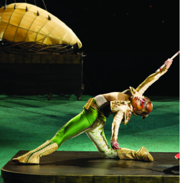
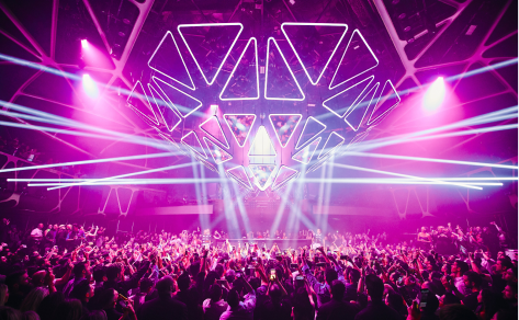

We also identified different moments in the user journey where users might require varying amounts of information. In certain cases, such as when users are in the early discovery phase, more detailed information is helpful, while in others, we could rely on the visual appeal of the images and reduce the amount of displayed content.
Grid: emphasizes visual impact with larger images and just the right amount of content.
List: presents more detailed information, better suited for users seeking specific content.
List: presents more detailed information, better suited for users seeking specific content.
These decisions represent our first attempt to systematize the ways we present the information of the different company offerings, including when, why, and to whom.
Our goal was to help teams understand better the limitations and potential card types available to them, and should also reduce the amount of work of figuring out what to do and when.
Additionally, our framework should allow for easier self-guidance in the short term.
Our goal was to help teams understand better the limitations and potential card types available to them, and should also reduce the amount of work of figuring out what to do and when.
Additionally, our framework should allow for easier self-guidance in the short term.
The first step was to list the elements that each category card could potentially display and determine the appropriate moments to showcase them. We worked with our product managers to define the must haves, nice-to-haves and out of scope functionalities.
Must have
Image
Title
Location
Price range
Cuisine type
Hours of operation
CTAs: Place an order, Find a table
Image
Title
Location
Price range
Cuisine type
Hours of operation
CTAs: Place an order, Find a table
Nice to have
Unique differentiators: New, Trending, Special Offer
Distance (mWeb & app specific)
Mobile ordering availability
Unique differentiators: New, Trending, Special Offer
Distance (mWeb & app specific)
Mobile ordering availability
Out of scope
Ratings and reviews
Next available reservation
Share
Save
Michelin star / Accolades
Ratings and reviews
Next available reservation
Share
Save
Michelin star / Accolades
Visual explorations
Our design system foundations already defined key elements like background color, elevation, type scale, button style, image aspect ratios, border radius and spacing, enabling us to concentrate primarily on establishing a strong visual hierarchy and interaction.
Final designs
After visual explorations we conducted multiple rounds of design reviews and accessibility checks, ultimately selecting a style that provides enhanced contrast and readability.
Handoff
Our design system leverages design tokens to build the majority of our components, and we utilize a few key tools to streamline the handoff process.
One is the Eightshapes specs plugin, which automatically generates redline documentation, and the other is an internal plugin we developed called "Show Me the Token." This tool allows us to select a pixel value, run the plugin, and instantly swap it for the corresponding token value, ensuring consistency and accuracy, while saving time.
One is the Eightshapes specs plugin, which automatically generates redline documentation, and the other is an internal plugin we developed called "Show Me the Token." This tool allows us to select a pixel value, run the plugin, and instantly swap it for the corresponding token value, ensuring consistency and accuracy, while saving time.
Documentation
It includes detailed do's and don'ts, along with fully documented component tokens and, design and content specs. We also provided in-depth guidance on when and where to use each card type, as well as, responsive behavior and motion guidelines.
Impact
Business wins
Maintenance costs
After implementing and rolling out all the cards, we calculate development time can be reduced by 50%, cutting maintenance costs by around 35%.
After implementing and rolling out all the cards, we calculate development time can be reduced by 50%, cutting maintenance costs by around 35%.
Scalability
New product offerings or platform expansions no longer require custom adjustments to card styles, ensuring that the system scales efficiently as the product grows.
New product offerings or platform expansions no longer require custom adjustments to card styles, ensuring that the system scales efficiently as the product grows.
Engagement
We enhanced the visual hierarchy and content relevance of item cards. Preliminary findings showed these improvements boosted user interaction and increased click-through rates by 10%.
We enhanced the visual hierarchy and content relevance of item cards. Preliminary findings showed these improvements boosted user interaction and increased click-through rates by 10%.
Other wins
Consistency across platforms
We resolved the inconsistencies by thoroughly reviewing and standardizing the design across all platforms. However, we did not collect data to validate whether this had a positive impact on key metrics.
We resolved the inconsistencies by thoroughly reviewing and standardizing the design across all platforms. However, we did not collect data to validate whether this had a positive impact on key metrics.
Accessibility
We addressed the accessibility issues by working closely with our accessibility team to ensure cards met industry standards. We increased font sizes, enhanced color contrast, and optimized navigation to make the cards easier to read and interact with for all guests.
We addressed the accessibility issues by working closely with our accessibility team to ensure cards met industry standards. We increased font sizes, enhanced color contrast, and optimized navigation to make the cards easier to read and interact with for all guests.

